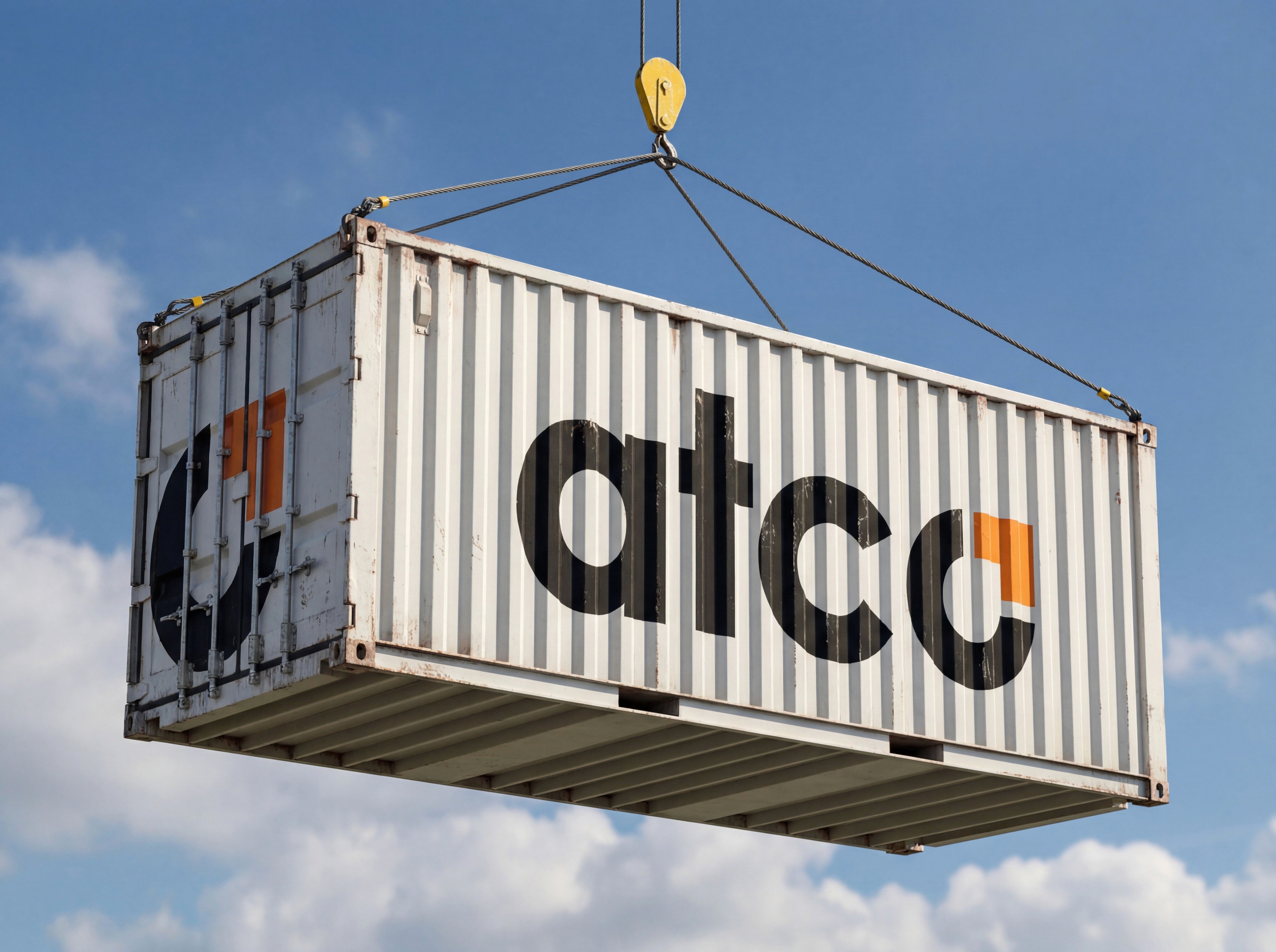
ATCO
The ATCO brand to reflect the precision, speed, and reliability demanded by modern logistics, while also catering to the logicistics of athletes on the road providing meals wherever the game takes them.
Introduction
We created the ATCO brand to reflect the precision, speed, and reliability demanded by modern logistics. Built around a clean, bold, and contemporary design system, the brand emphasizes clarity and confidence at every touchpoint—from digital platforms to physical applications in the field.
Strong typography, a disciplined color palette, and purposeful layout choices work together to communicate efficiency and control, while maintaining a modern edge that feels current and scalable. The result is a brand that looks as capable as the operation behind it—streamlined, dependable, and engineered for movement in today’s fast-paced logistics environment.


Challenges
We needed to convey not only the shipping and logistics aspect but also how the brand looks on their food services side of the business
Incorporating this brand across multiple applications worked out smoothly with a distinctive look that fit the variety that this business provides

Additional Viewing
To view the full brand book click here

View More.
Explore how Old Breed has helped businesses elevate their digital presence.